Switch
Switch
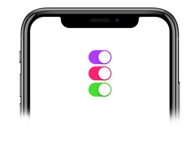
This component was built on top of React Native's Switch component and so it inherits all the props the native component has. This is a controlled component which requires the onValueChange prop so you can update the value state.
Usage
Imports:
import { Switch } from 'galio-framework';
Simple example:
<Switch
  value={this.state["switch-1"]}
  onValueChange={() => this.toggleSwitch("switch-1")}
/>
Modern usage with hooks:
const [isEnabled, setIsEnabled] = useState(false);

<Switch
  value={isEnabled}
  onValueChange={setIsEnabled}
  color="primary"
  disabled={false}
/>
Props
| Prop | Type | Default | Description |
|---|---|---|---|
| value | bool | false | The switch value |
| onValueChange | function | null | Callback when switch value changes |
| color | oneOfType(['primary', 'theme', 'error', 'warning', 'success', 'info']), string | GalioTheme.COLORS.PRIMARY | Switch color |
| disabled | bool | false | Disables the switch |
| initialValue | bool | false | Initial switch value |
| style | object | null | Custom styles |
| trackColor | object | null | Track colors for on/off states |
| thumbColor | string | null | Thumb color |
| ios_backgroundColor | string | null | iOS background color |
| ...Switch.props | - | - | All React Native Switch props are supported |