Button
Button
A basic button component that is looking good on any platform. This react native button is ready to handle most used scenarios which will enable you to build apps faster with cleaner code.

Usage
Imports:
import { Button } from 'galio-framework';
Code example:
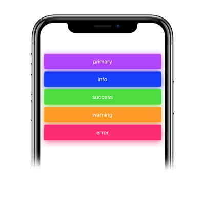
<Button>primary</Button>
<Button color="info">info</Button>
<Button color="success">success</Button>
<Button color="warning">warning</Button>
<Button color="error">error</Button>
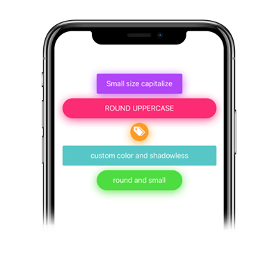
Advanced examples:
<Button
  color="primary"
  size="large"
  shadowless
  onPress={() => console.log('Button pressed')}
>
  Press Me
</Button>

<Button
  color="success"
  icon="check"
  iconFamily="antdesign"
  iconSize={16}
  loading={true}
  loadingSize="small"
>
  Loading Button
</Button>
Props
| Prop | Type | Default | Description |
|---|---|---|---|
| children | node | null | Button content |
| color | string | 'primary' | Color options: 'primary', 'theme', 'error', 'warning', 'success', 'transparent' or custom color |
| size | string | 'large' | Size options: 'large', 'small' |
| disabled | bool | false | Disables the button |
| loading | bool | false | Shows loading spinner |
| loadingSize | string | 'small' | Loading spinner size: 'small', 'large' |
| icon | string | null | Icon name from Expo's icon library |
| iconColor | string | theme.COLORS.BLACK | Icon color |
| iconFamily | string | null | Icon family from Expo's icon library |
| iconSize | number | 14 | Icon size |
| onlyIcon | bool | false | Styling for icon-only buttons |
| capitalize | bool | false | Transforms first character to uppercase |
| uppercase | bool | false | Makes all letters uppercase |
| lowercase | bool | false | Makes all letters lowercase |
| radius | number | 0 | Border radius |
| shadowless | bool | false | Removes shadow |
| shadowColor | string | null | Custom shadow color |
| opacity | number | 0.8 | Button opacity |
| onPress | function | null | Press handler function |
| style | object | null | Custom styles |
| textStyle | object | null | Custom text styles |
| ...TouchableOpacity.props | - | - | All TouchableOpacity props are supported |