Input
Input
Built on top of React Native's TextInput component, this basic component which allows the user to enter text was styled based on Galio's own identity theme.
Usage
Imports:
import { Input, Block } from 'galio-framework';
Basic examples:
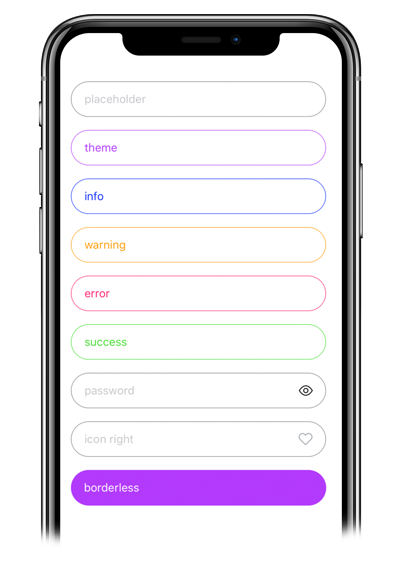
<Input placeholder="regular" />
<Input placeholder="theme" color={theme.COLORS.THEME} style={{ borderColor: theme.COLORS.THEME }} placeholderTextColor={theme.COLORS.THEME} />
<Input placeholder="info" color={theme.COLORS.INFO} style={{ borderColor: theme.COLORS.INFO }} placeholderTextColor={theme.COLORS.INFO}/>
<Input placeholder="warning" color={theme.COLORS.WARNING} style={{ borderColor: theme.COLORS.WARNING }} placeholderTextColor={theme.COLORS.WARNING}/>
<Input placeholder="error" color={theme.COLORS.ERROR} style={{ borderColor: theme.COLORS.ERROR }} placeholderTextColor={theme.COLORS.ERROR}/>
<Input placeholder="success" color={theme.COLORS.SUCCESS} style={{ borderColor: theme.COLORS.SUCCESS }} placeholderTextColor={theme.COLORS.SUCCESS}/>
Advanced examples:
<Input placeholder="password" password viewPass />
<Input placeholder="rounded input" rounded />
<Input
  placeholder="Input with Icon on right"
  right
  icon="heart"
  iconFamily="antdesign"
  iconSize={14}
  iconColor="red"
/>
<Input
  placeholder="Input with custom styling and help"
  style={{ borderColor: "red" }}
  help="Bottom help text"
  bottomHelp
  placeholderTextColor="#4F8EC9"
/>
Modern usage with hooks:
const [value, setValue] = useState('');

<Input
  value={value}
  onChangeText={setValue}
  placeholder="Controlled input"
  color="primary"
  rounded
  shadowless
/>
Props
| Prop | Type | Default | Description |
|---|---|---|---|
| value | string | null | The input value (controlled component) |
| onChangeText | function | null | Callback when text changes |
| type | string | 'default' | Keyboard type. Options: 'default', 'number-pad', 'decimal-pad', 'numeric', 'email-address', 'phone-pad' |
| password | bool | false | Password input with secure text entry |
| placeholderTextColor | string | theme.COLORS.PLACEHOLDER | Placeholder text color |
| label | string | null | Input label |
| bgColor | string | null | Background color |
| rounded | bool | false | Rounded corners |
| borderless | bool | false | Removes border |
| viewPass | bool | false | Password visibility toggle |
| icon | string | null | Icon name from Expo's icon library |
| iconColor | string | null | Icon color |
| iconFamily | string | null | Icon family from Expo's icon library |
| iconSize | number | 14 | Icon size |
| color | string | null | Text color |
| help | string | null | Helper text |
| left | bool | true | Icon on the left |
| right | bool | false | Icon on the right |
| topHelp | bool | true | Helper above input |
| bottomHelp | bool | false | Helper below input |
| style | object | null | Custom styles |
| inputStyle | object | null | Custom input styles |
| labelStyle | object | null | Custom label styles |
| helpStyle | object | null | Custom help text styles |
| ...TextInput.props | - | - | All TextInput props are supported |