Checkbox
Checkbox
Checkboxes allow users to complete tasks that involve making choices such as selecting options, or switching settings on or off. Using the onChange function will enable you to call a function when the state value changes, so basically whenever the user is tapping the Checkbox.
Usage
Imports:
import { Checkbox } from 'galio-framework';
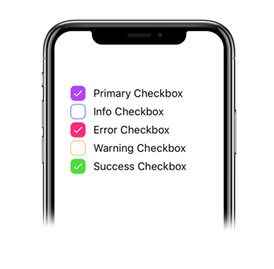
Basic examples:
<Checkbox color="primary" label="Primary Checkbox" />
<Checkbox color="info" label="Info Checkbox" />
<Checkbox color="error" label="Error Checkbox" />
<Checkbox color="warning" label="Warning Checkbox" />
<Checkbox color="success" label="Success Checkbox" />
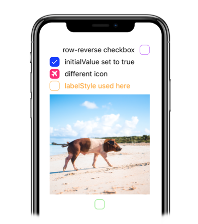
Advanced examples:
<Checkbox color="primary" flexDirection="row-reverse" label="row-reverse checkbox" />
<Checkbox color="info" initialValue={true} label="initialValue set to true" />
<Checkbox color="error" initialValue={true} label="different icon" iconFamily="font-awesome" iconName="plane" />
<Checkbox color="warning" labelStyle={{ color: '#FF9C09' }} label="labelStyle used here" />
<Checkbox color="success" image="https://images.unsplash.com/photo-1569780655478-ecffea4c165c?ixlib=rb-1.2.1" flexDirection="column-reverse"/>
Modern usage with hooks:
const [isChecked, setIsChecked] = useState(false);

<Checkbox
  color="warning"
  value={isChecked}
  onChange={setIsChecked}
  label="onChange is here"
/>
Props
| Prop | Type | Default | Description |
|---|---|---|---|
| label | string | null | Checkbox label text |
| color | string | 'primary' | Checkbox color |
| value | bool | false | Controlled checkbox value |
| onChange | function | null | Callback when checkbox state changes |
| initialValue | bool | false | Initial checkbox value |
| disabled | bool | false | Disables the checkbox |
| flexDirection | string | 'row' | Layout direction: 'row', 'row-reverse', 'column', 'column-reverse' |
| iconName | string | null | Custom icon name |
| iconFamily | string | null | Custom icon family |
| image | string | null | Custom image URL |
| checkboxStyle | object | null | Custom checkbox styles |
| labelStyle | object | null | Custom label styles |
| containerStyle | object | null | Custom container styles |
| style | object | null | Custom styles |