Accordion
Accordion
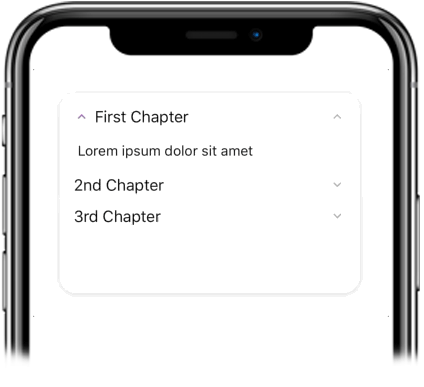
This accordion component made by Galio is easily customizable. Built with Flatlist, this expandable list can be used to only show relevant information and save space in your screen.
Usage
Imports:
// import { Accordion, Block } from 'galio-framework';
Simple example:
<Block style={{ height: 200 }}>
  <Accordion dataArray={data} />
</Block>
The data array looks like:
const data = [
  { title: "First Chapter", content: "Lorem ipsum dolor sit amet",
    icon: {
      name: 'keyboard-arrow-up',
      family: 'material',
      size: 16,
    }
 },
  { title: "2nd Chapter", content: "Lorem ipsum dolor sit amet" },
  { title: "3rd Chapter", content: "Lorem ipsum dolor sit amet" }
];
Advanced examples:
<Accordion
  dataArray={data}
  opened={0}
  icon="chevron-down"
  iconFamily="feather"
  iconSize={20}
  iconColor="primary"
  listStyle={{ backgroundColor: 'white' }}
  style={{ margin: 16 }}
/>

<Accordion
  dataArray={customData}
  opened={-1}
  customIcon={
    <Icon name="plus" family="feather" size={16} color="primary" />
  }
  onToggle={(index) => console.log('Toggled:', index)}
/>
Props
| Prop | Type | Default | Description |
|---|---|---|---|
| dataArray | array | null | Array of objects with keys: title, content, icon: style |
| opened | number | -1 | Index of initially opened accordion item |
| icon | string | null | Icon name for accordion items |
| iconFamily | string | null | Icon family for accordion items |
| iconSize | number | 16 | Icon size |
| iconColor | string | null | Icon color |
| customIcon | component | null | Custom icon component |
| listStyle | object | null | FlatList style |
| style | object | null | Container styles |
| onToggle | function | null | Callback when accordion item is toggled |
| ...FlatList.props | - | - | All FlatList props are supported |