Slider
Slider
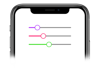
We all need a slider in our application. This is a JavaScript component built with the PanResponder and Animated APIs.
Usage
Imports:
import { Slider, Block } from 'galio-framework';
Simple example:
<Block flex>
  <Slider
    maximumValue={30}
    value={10}
    onSlidingComplete={() => this.registerTheValue()}
  />
</Block>
Modern usage with hooks:
const [sliderValue, setSliderValue] = useState(10);

<Slider
  value={sliderValue}
  onValueChange={setSliderValue}
  minimumValue={0}
  maximumValue={100}
  step={1}
  activeColor="primary"
  trackColor="grey"
/>
Props
| Prop | Type | Default | Description |
|---|---|---|---|
| value | number | 0 | The current value of the slider |
| onValueChange | function | null | Callback when slider value changes |
| onSlidingComplete | function | null | Callback when sliding is complete |
| activeColor | string | GalioTheme.COLORS.PRIMARY | Active track color |
| trackColor | string | GalioTheme.COLORS.GREY | Inactive track color |
| thumbColor | string | GalioTheme.COLORS.PRIMARY | Thumb color |
| disabled | bool | false | Disables the slider |
| minimumValue | number | 0 | Minimum slider value |
| maximumValue | number | 100 | Maximum slider value |
| step | number | 1 | Step increment value |
| trackStyle | object | {} | Custom track styles |
| thumbStyle | object | {} | Custom thumb styles |
| style | object | {} | Custom container styles |