Interruptor
Interruptor
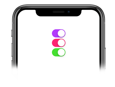
Este componente fue construido sobre el componente Switch de React Native y por lo tanto hereda todas las props que tiene el componente nativo. Este es un componente controlado que requiere la prop onValueChange para que puedas actualizar el estado del valor.
Uso
Importaciones:
import { Switch } from 'galio-framework';
Ejemplo simple:
<Switch
  value={this.state["switch-1"]}
  onValueChange={() => this.toggleSwitch("switch-1")}
/>
Uso moderno con hooks:
const [isEnabled, setIsEnabled] = useState(false);

<Switch
  value={isEnabled}
  onValueChange={setIsEnabled}
  color="primary"
  disabled={false}
/>
Props
| Prop | Tipo | Predeterminado | Descripción |
|---|---|---|---|
| value | bool | false | El valor del interruptor |
| onValueChange | function | null | Callback cuando cambia el valor del interruptor |
| color | oneOfType(['primary', 'theme', 'error', 'warning', 'success', 'info']), string | GalioTheme.COLORS.PRIMARY | Color del interruptor |
| disabled | bool | false | Deshabilita el interruptor |
| initialValue | bool | false | Valor inicial del interruptor |
| style | object | null | Estilos personalizados |
| trackColor | object | null | Colores de la pista para estados on/off |
| thumbColor | string | null | Color del pulgar |
| ios_backgroundColor | string | null | Color de fondo para iOS |
| ...Switch.props | - | - | Todas las props de React Native Switch son compatibles |